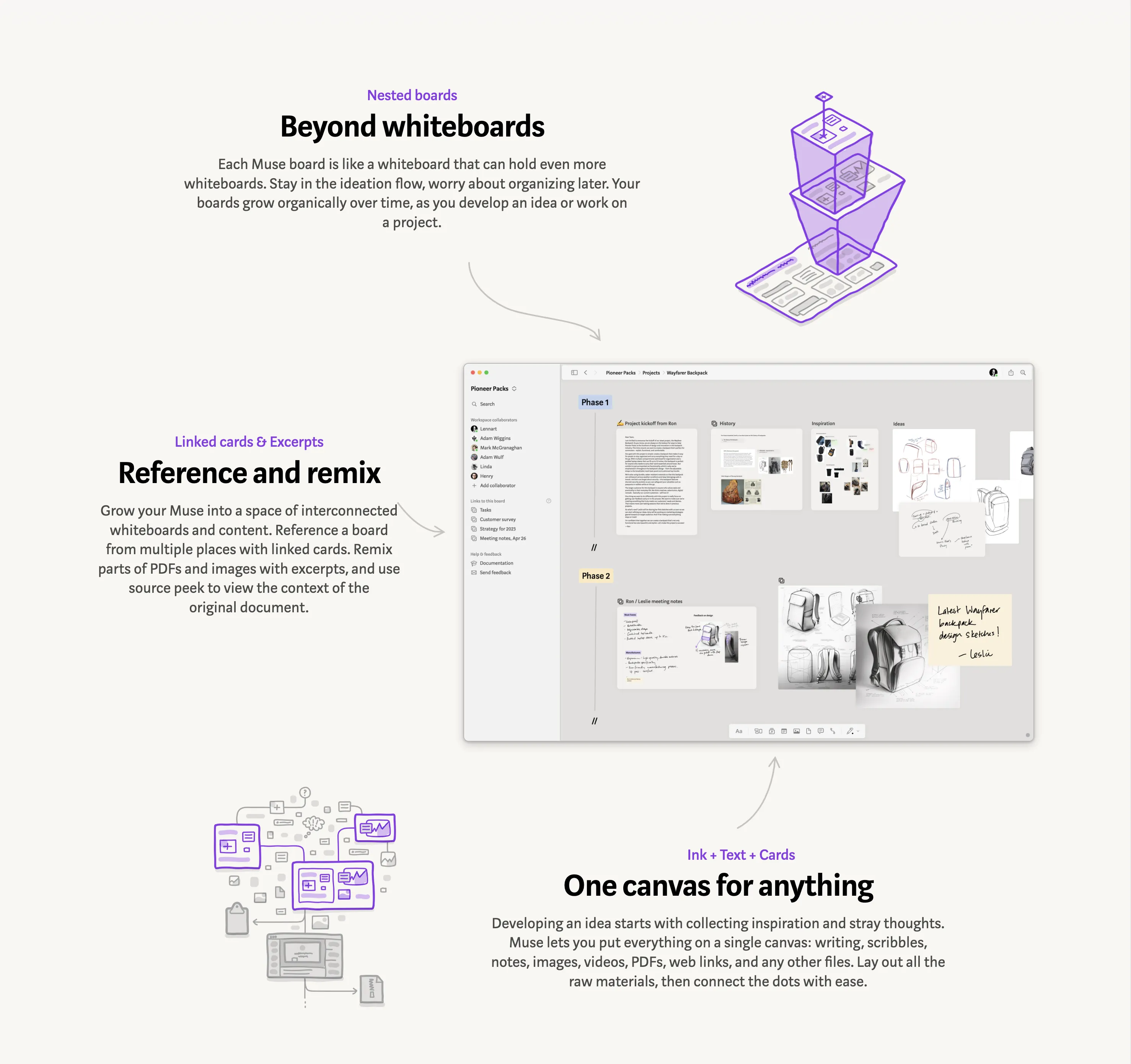
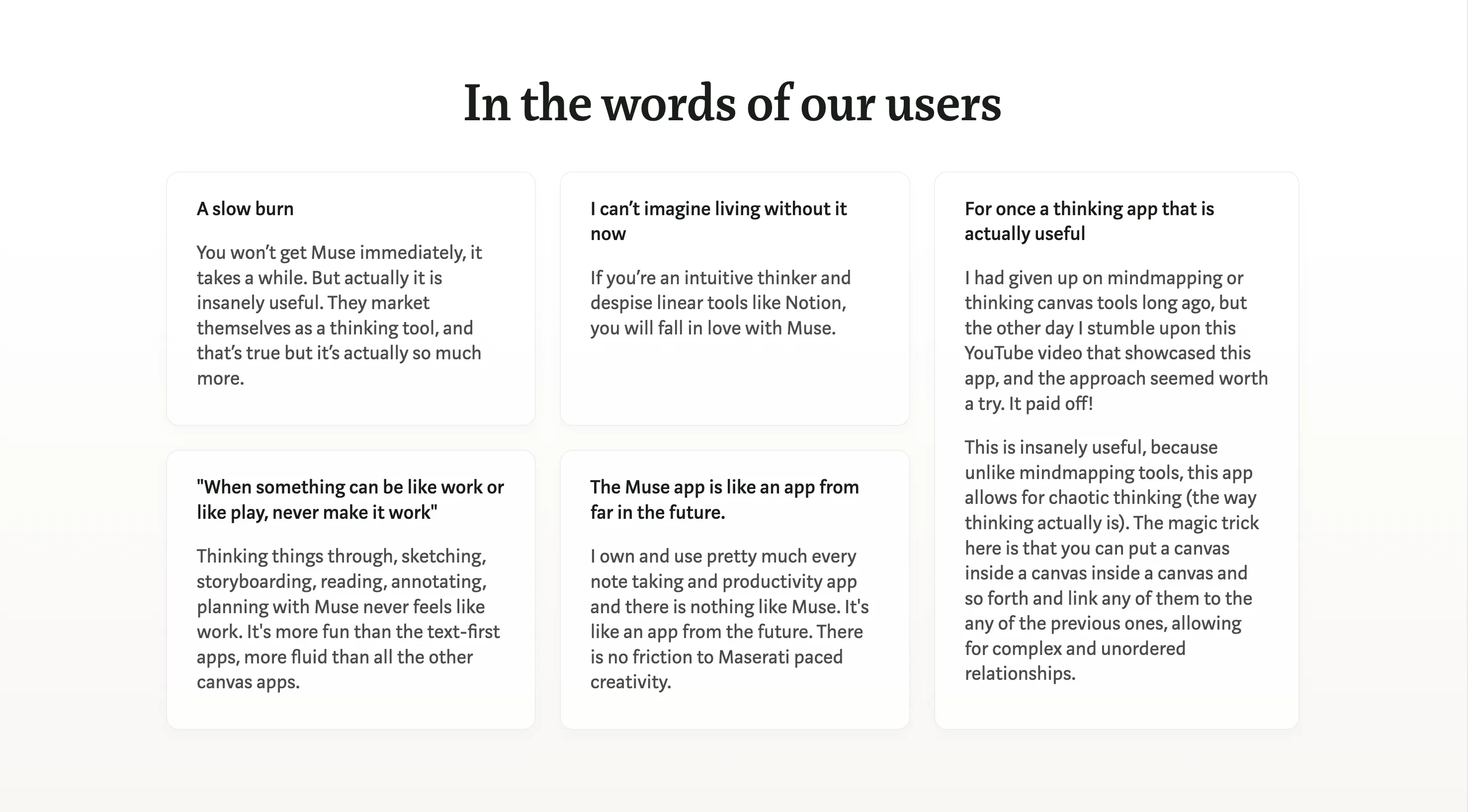
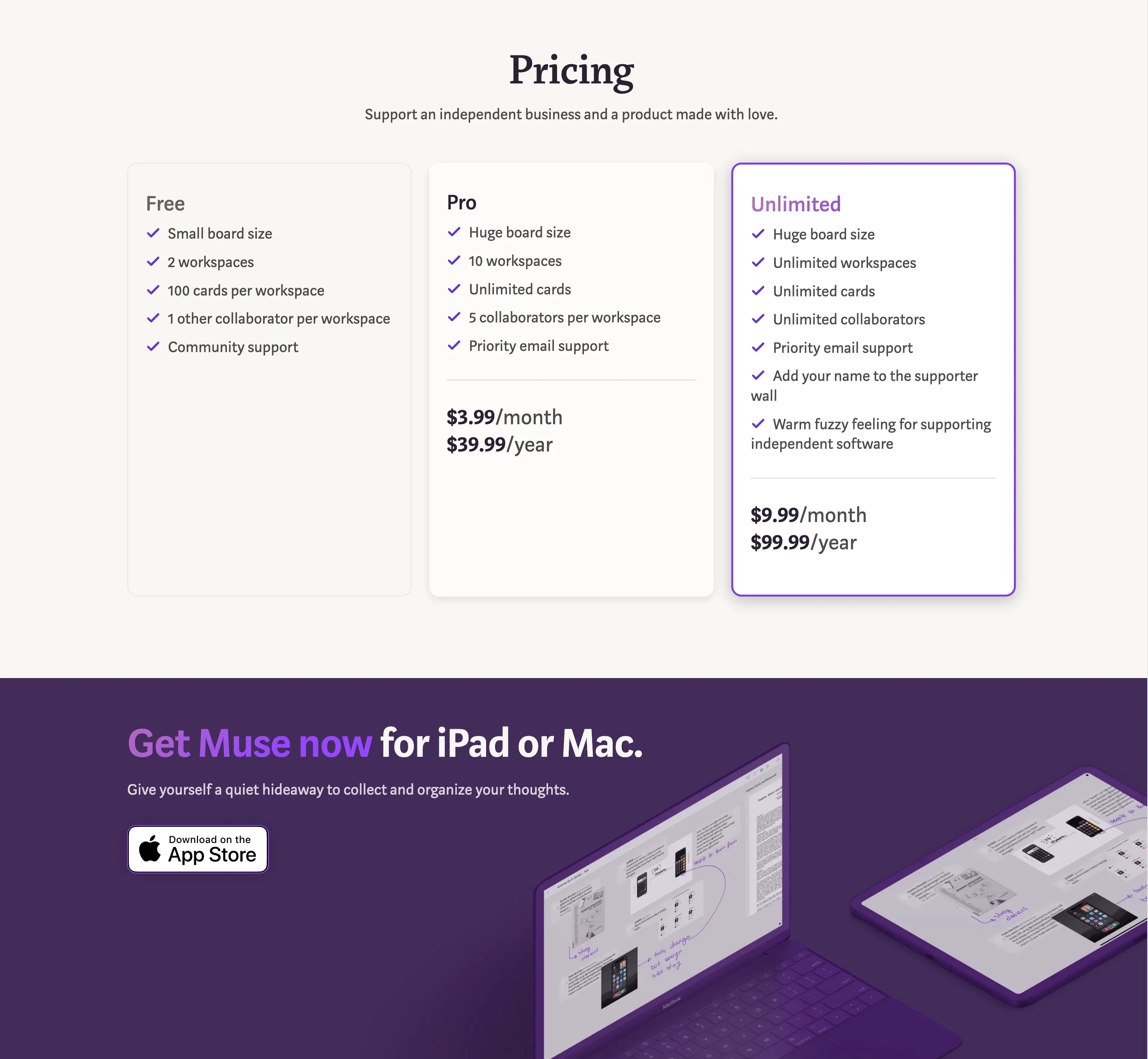
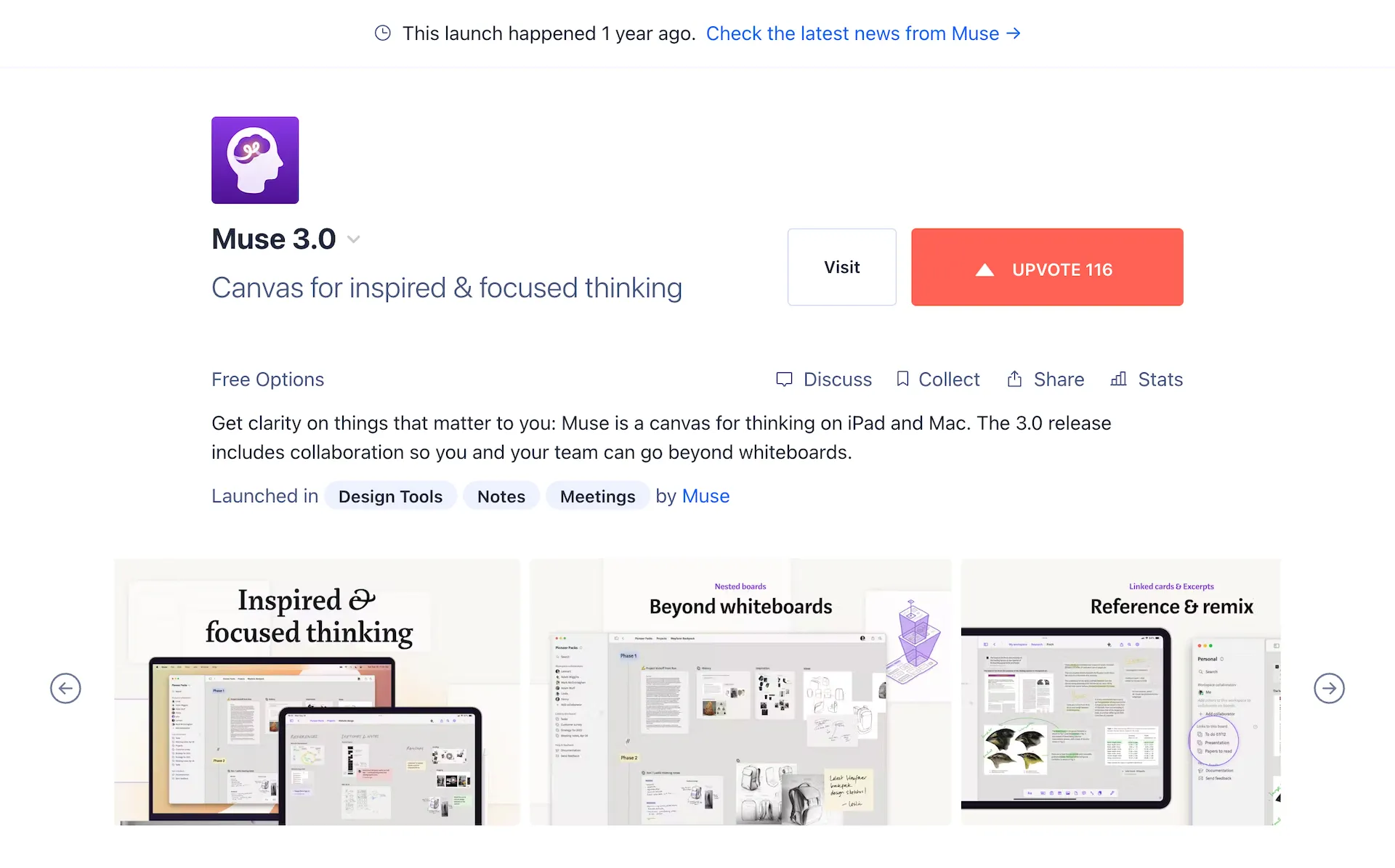
Muse is a canvas for inspired & focused thinking. I was a designer & storyteller at Muse 2022-2023 and had the opportunity to work on the messaging, website, and simplified user’s handbook for the 3.0 launch. I worked closely with our lead product designer and lead storyteller with input from the rest of the team. The project lasted just over 2 months.
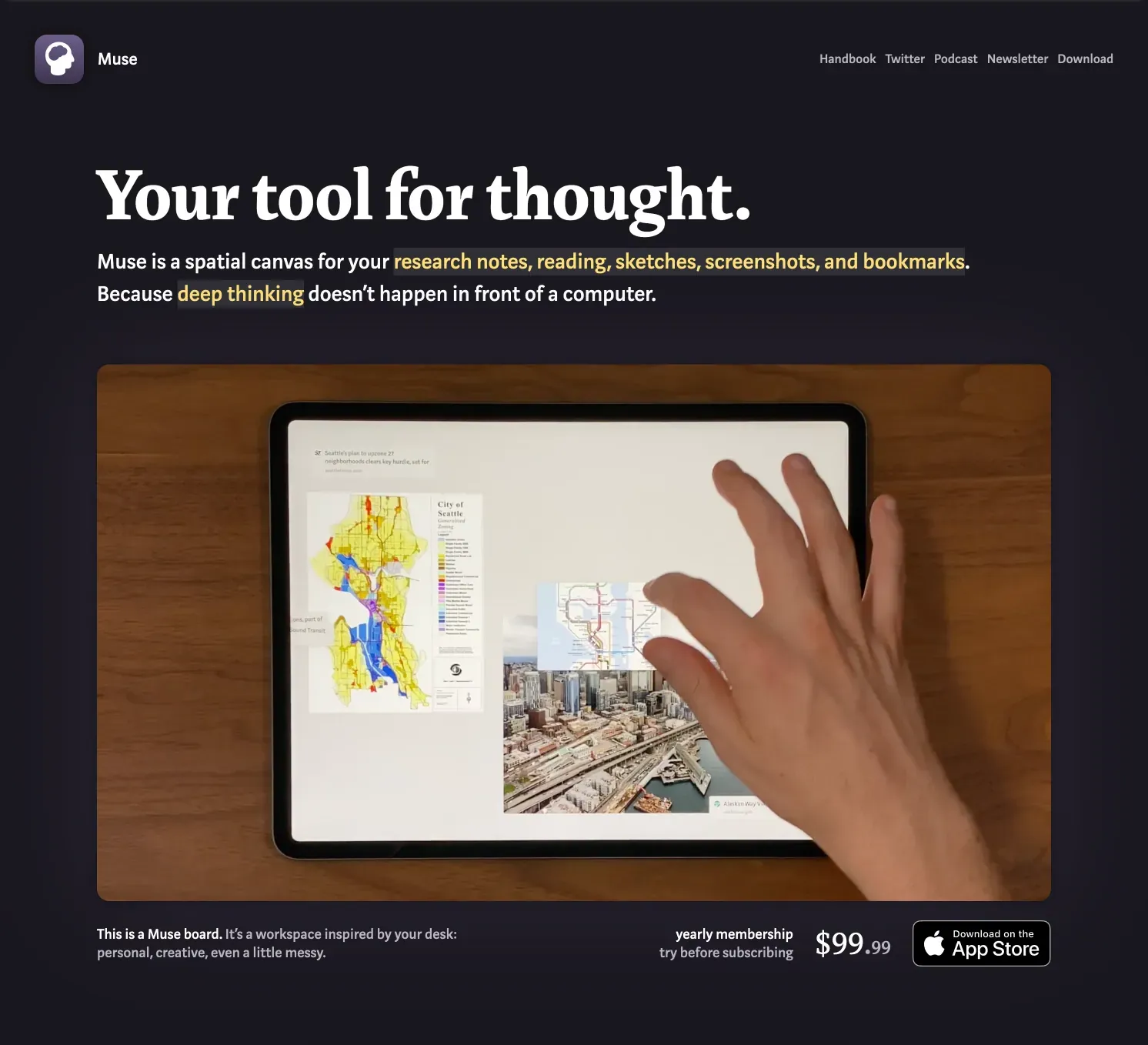
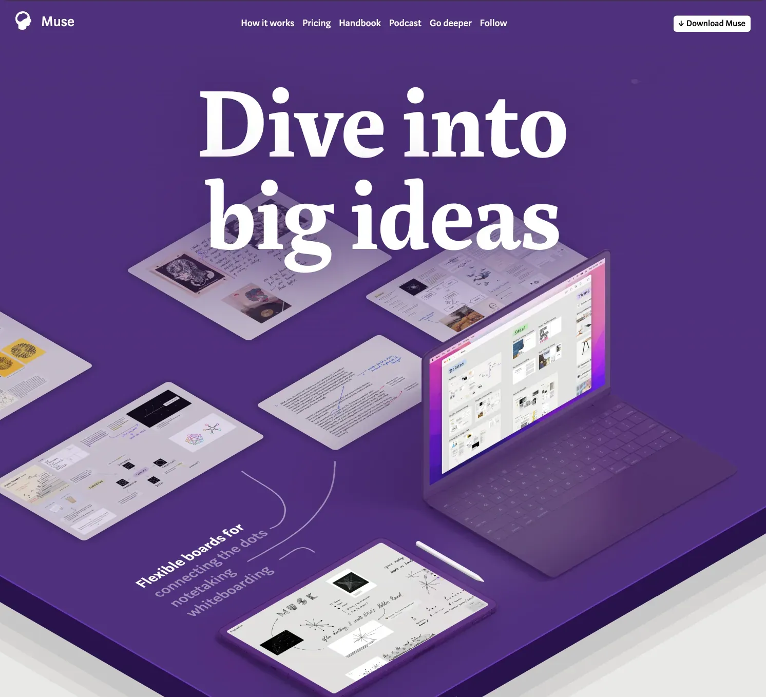
Visit landing page
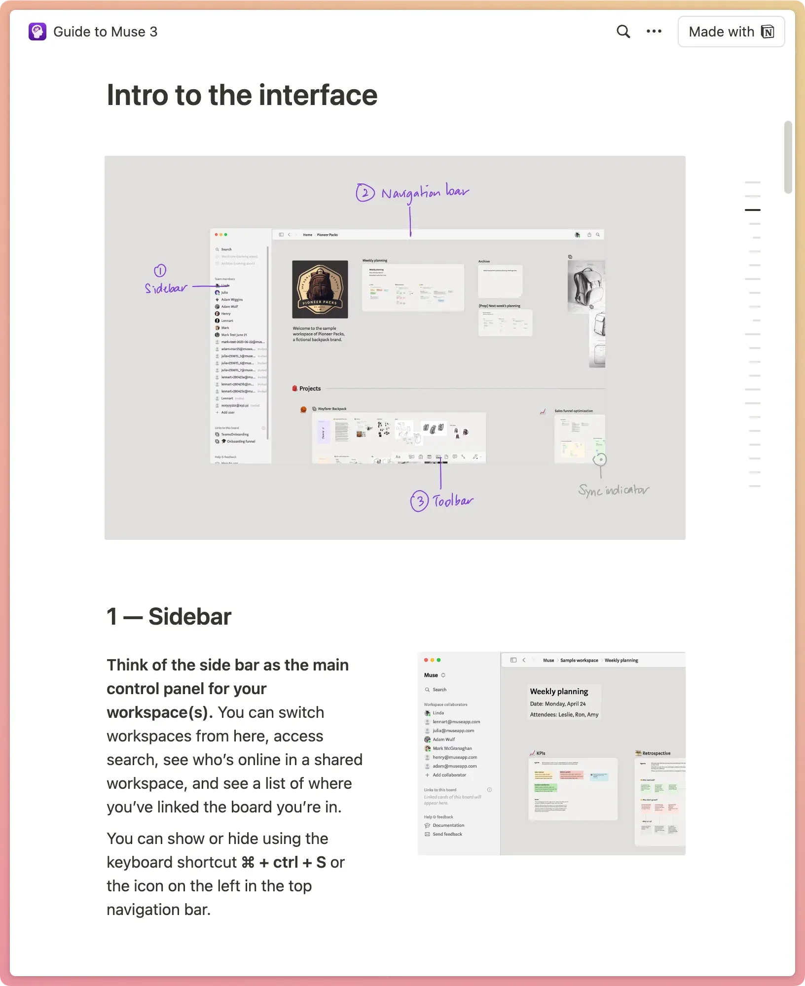
Read users’ handbook
See Product Hunt campaign
More content design work
New era
The team, originally a group of seven, was transitioning to an independent, one-person operation. The goal of the 3.0 launch was to communicate this shift and reposition Muse for individual use after several months of experimenting with a team-centric model. The main challenge for storytelling was to update and simplify the website and other content to make it straightforward for one person to maintain in the future.
For thinking
Our approach was to review Muse’s history, distill what had worked, and blend it with new materials from the teams phase. The messaging was inspired by the language of our users. Feedback messages, reviews, and survey results have shown us that Muse’s role in users’ workflows is most commonly described as ‘thinking’ or ‘figuring things out’—a reflection of Muse’s early messaging strategies.
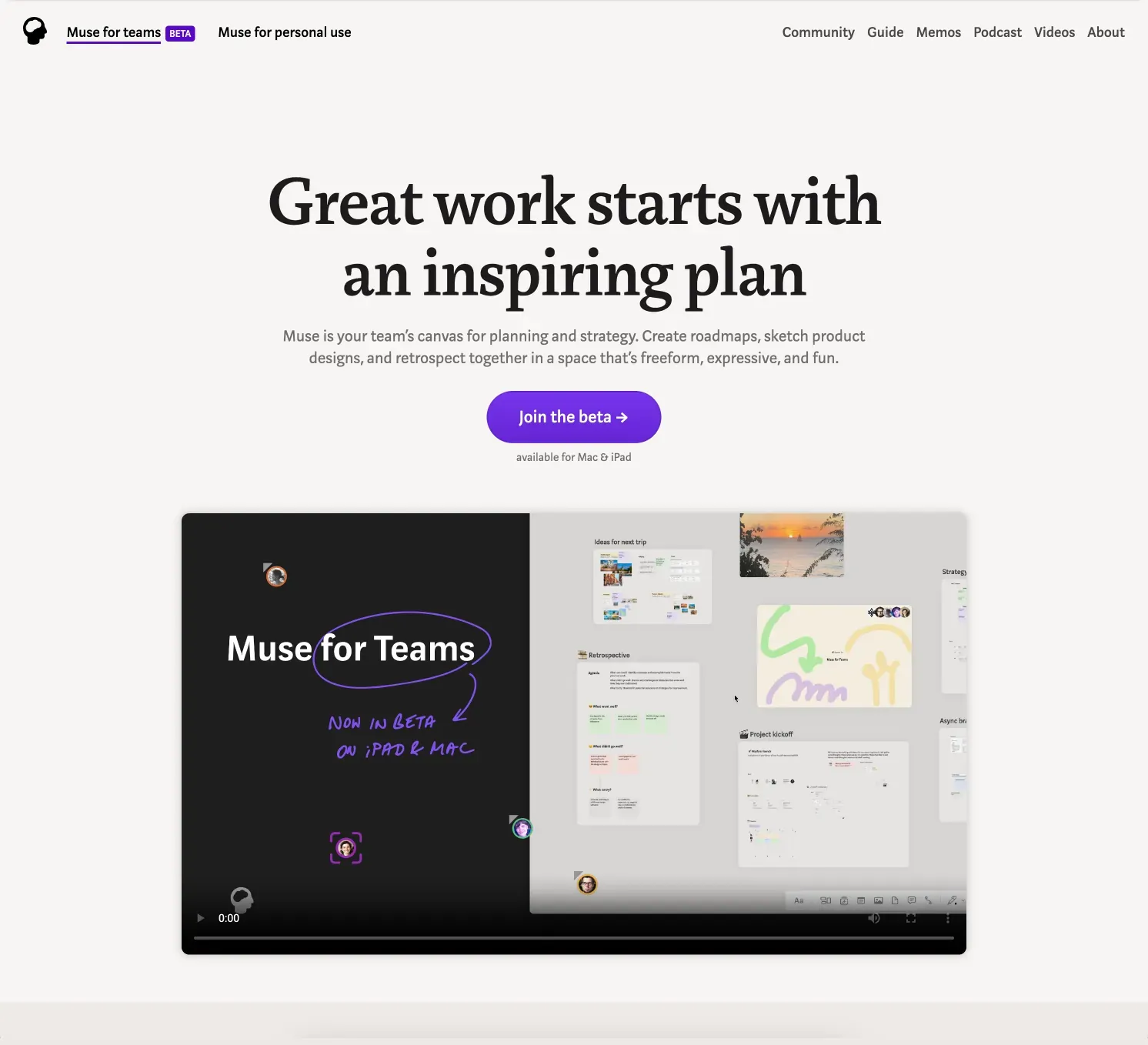
Calm, focused, and inspiring
Muse’s brand was built around a tone of calm, focus, and thoughtfulness. Originally designed for the messy middle of the creative process—where ideas accumulate and need to be made sense of—we aimed to evolve the calm tone by weaving in the freeform expressiveness of the product.
Expressing your ideas in Muse meant working with multimedia content and raw thoughts, without getting bogged down by presentation and styling options, which are less important in the early stages of ideation.
As we crafted the new messaging and redesigned the website, our goal was to maintain the thoughtful foundation while emphasizing the inspired feeling you get when you’re doing focused thinking. Muse’s aim is to create an environment where working with your ideas feels intuitive and open-ended, ultimately helping you gain clarity on what matters most.
